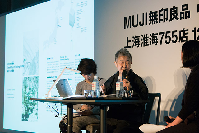
Kazuko Koikea life with MUJI
Today, I’ll talk in Japanese about MUJI, or no-brand quality goods. I’ll tell you about the overall image of the lifestyle goods known globally as MUJI, and the story of MUJI goods, from their creation to the present. Actually, I share a bit of the responsibility for MUJI’s creation. I was the midwife in the process, so to speak. I chose to use the phrase “a life” in the title of my talk today, because it is, in part, a record of my life with MUJI, as well.
In December 1980, MUJI was revealed in major Japanese newspapers in a monochrome ad.
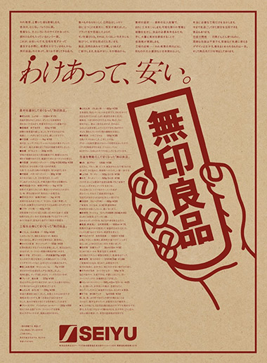
Our art director at the time, Ikko Tanaka, was said to be the best at keeping traditional Japanese aesthetics in modern design, and he used MUJI’s corporate color to print a poster on kraft paper. The visual is based on an iconic image in Japanese period dramas where a card is held up indicating the correct answer to a given situation. The card printed with “MUJI” was such a well-known visual that even grandfathers, grandmothers, and children understood that it meant “MUJI is it!”I think everybody who saw the Japanese characters for no-brand quality goods (MUJI) for the first time wondered, “What is this?” I wrote this ad. The catch phrase is, “Lower priced for a reason.” “Reason” means the reason for these products. This poster explains why we’re able to offer each product for a reasonable price. Most advertising presents a slogan promoting how wonderful an item is. But this ad doesn’t say a word about how wonderful the products are. We don’t need a brand name to sell products, because they are already meaningful in themselves. MUJI simply communicates the value of an item. It takes a “hands-off” approach by simply presenting the item itself.
In the 1980s, the Japanese economy was thriving, headed for what we ended up calling the bubble economy. It became standard to sell products at a price much higher than the actual quality by slapping the logo of a famous brand on them. At MUJI, we thought that was an improper application of added value. A product design that accurately communicates an item’s true value is important. This is almost a joke, but a toilet paper holder cover embroidered with the CHANEL logo was sold at that time in Japan. If Coco Chanel were alive, she’d probably have thought, “Oh my. My name is being used in the toilet.”
The MUJI poster from that time is printed with Seiyu, the name of a supermarket where MUJI started. Seiji Tsutsumi was the owner of both Seibu Department Store and Seiyu. In 1979, he brought together managers, designers, and writers like me, and others, to brainstorm on creating a private brand. We discussed what kind of brand we wanted to make in Japan at that time. That was the actual starting point for MUJI.
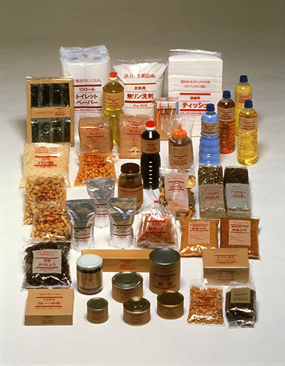
At the time, there were 40 MUJI products. Today, MUJI Shanghai has 7,000 products, but we started with 40 very basic items.The number one requirement was to start with essential items for day-to-day life. The idea was that tools used in daily life have to be easy to use. If it was food, it had to be delicious, with safe ingredients. Clothes are chosen with a focus on materials, and comfort is valued. The production process is thoroughly inspected, and packaging simplified to avoid unnecessary costs. By achieving all of that, MUJI was confident it could present prices to consumers suitable to product content. Ever since, the foundation of MUJI’s corporate identity that we’ve inherited has kept growing.
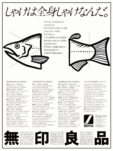
Let me show you some posters from those days. At a glance, they are all quite plain and nothing particularly special. For example, there was a poster of dried shiitake mushrooms that were slightly damaged during the production process. In the Japanese market, only perfectly round shiitake were sold, but MUJI sold imperfectly shaped shiitake because they taste just as delicious. In another poster, the copy reads “The entire fish is salmon.” This is straightforward copy reminding readers that salmon is delicious head to tail, so all of it should be eaten. Even as the Japanese economy moved closer and closer toward an economic bubble, we had positive feedback from so many consumers back then who wanted to focus on the simple things in life.
The concept of MUJI originated with an abundance of knowledge and research results from supermarket merchandising. The notion was also born that even better products come from things that have been overlooked or deviate from the standard. That was reflected in later product planning.Establishing MUJI was based on the three approaches of good products, good environment, and good information. Since the beginning, our products and information have been integrated as one. The idea of a “good environment” expresses the same spirit. In other words, we want our stores to be good settings for our products. At first, food and lifestyle accessories were developed for separate sections of Seiyu supermarkets. But realizing that, together, these products could create a cohesive lifestyle, we opened our first shop in Aoyama. Takashi Sugimoto designed the store. He put his full skills on display in this Shanghai store, too. The Aoyama store exterior is made from brick used in blast furnaces in Kyushu coalmines. It is these and other weathered materials that have created the space for this new store.
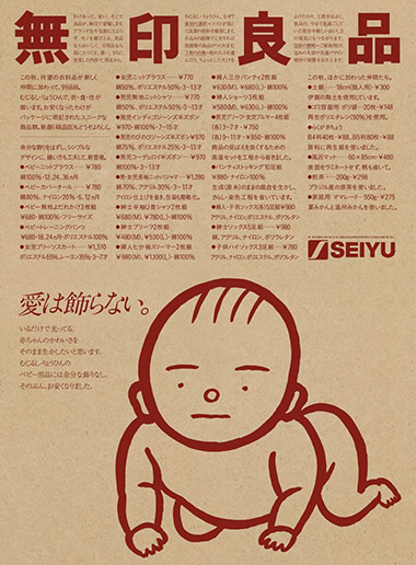
In our corporate advertising, the MUJI attitude was summed up in a single catch phrase, “Love doesn’t need embellishment.” To babies, materials gentle on the skin are an expression of their mother’s gentle love. Materials are more important than strong colors or lots of adornments. That was the foundation for this kind of symbolic visual. The illustration for this corporate ad was quickly sketched by my colleague, who has since passed away, Yuzo Yamashita. Using simple ink drawings, Ikko Tanaka’s art direction focuses plainly on a single idea.
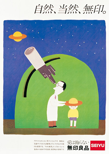
Next, I’ll show you a poster from around that time.A doctor is observing the heavens and puts a hat on the child that looks just like one of Saturn’s rings. This was drawn by Makoto Wada. The copy is “Nature, Naturally, MUJI.” Nature is what creates our environment. MUJI wants to be like nature and this thought naturally shapes MUJI. Although I wrote that copy in all seriousness, the illustrator created a humorous picture to accompany it. This is an example of spontaneous synergy in ad development.
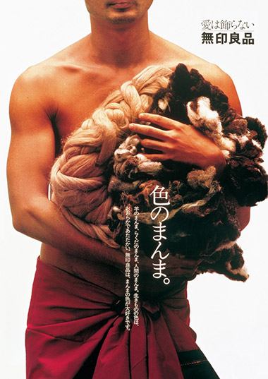
“Colors as they are.” MUJI is all about manufacturing that passes on nature, unembellished. We know that the environment in which sheep are raised or their breed results in various colors. Our concept is to pass that on and enable people to wear materials just as they are in nature.
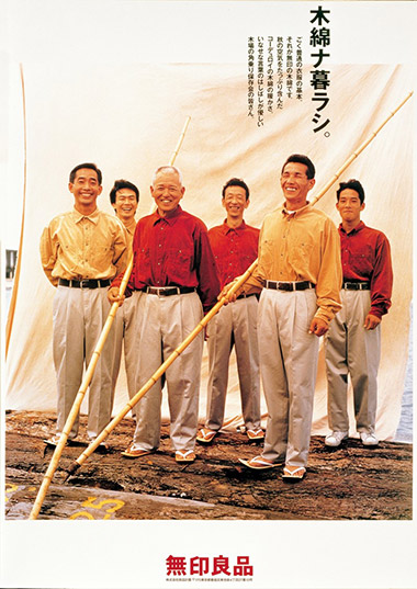
“Living with cotton.” The men seen on this poster are skilled workers in a lumber yard in the Tokyo bay area. They became models for the shirts, because MUJI wants to champion people who are actually living the lifestyle.
One day we received an airmail letter from Liberty Department Store in London. Liberty has played a very important role in the history of design in England. For a long time, it has studied and introduced the East to the West. In the letter, a merchandizer from that department store was inviting MUJI to Liberty’s 110th anniversary event, to represent the most outstanding project and products from the East at the time. The letter said, “We are always learning from the East, and we are studying modern manufacturing from MUJI.” We were surprised. That eventually led to the opening of the first overseas MUJI store on the Carnaby Street side of Liberty. Currently, there are more than 700 MUJI stores in 26 countries and regions. This Shanghai flagship store will also gain notoriety throughout the world.
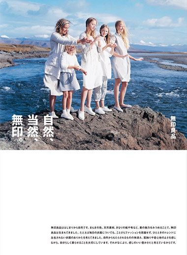
“Nature, Naturally, MUJI” was used again in a poster directed by Kenya Hara during the 2015 campaign. I’m very happy to see this copy I wrote used again 30 years later; it shows that the MUJI hasn’t wavered in its message.
Next, I’d like to talk about our emerging awareness based on the recent MUJI store environment.Let’s look at this small graphic of individual MUJI products that allows employees, customers, and part-time workers to share the MUJI identity. The graphic expresses anew that the MUJI identity is one of manufacturing that is attentive to details.First is the awareness that we need to be gentle on the mind and body. The design expression is also quiet and persuasive.Second is the awareness that we need to be good to the earth’s environment. We are reaching the limits of Earth’s resources, and you all know the consequences of water containing detergents and other substances flowing into the ground. Or, a breakdown comes from using too much electricity. MUJI considers all those things in product planning.Third is the awareness that our products must have a global feel. This is about being able to share products with consumers worldwide, rather than only in Japan. For instance, right-angle socks were created because human feet are built at a 90° angle from the ankle. Turtlenecks made out of wool alone are scratchy and bothersome. MUJI added cotton to the neck, for a turtleneck that isn’t scratchy. This Japanese tableware can also be used for western-style and Chinese meals. MUJI believes in creating basic products that fulfill the three human needs—food, clothing, and shelter. The title of this talk, “a life is MUJI,” refers to lifestyles where MUJI delivers these three key elements.
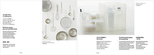
Let’s look a little closer at a few details.Kitchen tools made from the same stainless steel, for example.Next are polypropylene boxes. These neatly organize cosmetics and other items that tend to multiply around the sink. Each item has its place and nothing crowds out anything else.Everyone puts a lot of thought into face lotion. We researched what kind of water would most easily moisturize the skin and found an amazing water vein deep in the mountains of Iwate prefecture in the Tohoku region. It is with this water that we created our skin care products.MUJI began not from design, but from the necessities of daily life. The goal is not just to sell design, but I’d like you to think of MUJI as items most necessary for living that also possess good design.For example, using acrylic frames from MUJI to decorate with pictures or photos. I found some nice frames without really giving much thought about how they would attach to the wall.
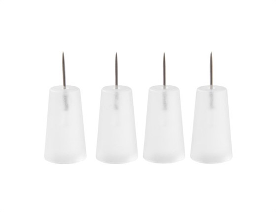
And then I found this amazing MUJI pushpin. The tip is extremely thin so that there is almost no mark left after it was taken out of the wall. I was impressed by the merchandising staff at MUJI who thought to make such a thin tip.
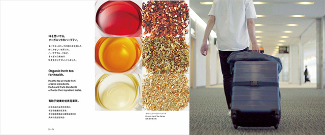
This is organic herb tea. Good ingredients are beautiful. My point is that good materials are also beautiful in appearance.This kind of hard shell suitcase is not only about function, but the beauty of the shape and the feel of the materials are also significant elements of the design.
We live in an age of the pursuit of luxury, and in response, MUJI reexamines the idea of what is just right in its product development. The response to our approach has continued to exceed our expectations. Behind this positive response, I think, is what we call wabi-sabi (subdued refinement), which values and recognizes the beauty in the expression of things that have aged and things that are incomplete. MUJI has used the monochrome design policy produced for the early designs by Ikko Tanaka, and the ink illustration drawn by Yuzo Yamashita. I focused on the sensibilities of the Japanese consumers who welcomed them. They simply share something that is understood from information that communicates the truth of the products. I think that “something” is based on people’s expectations of daily life as expressed in the items they use and what they eat. The feeling of “I’d be happy if I had this” is extremely varied and wide ranging, but I think the idea that simple, basic goods are fine for normal everyday life is universal. That’s the reason that MUJI is chosen and used in both Northern Europe and Arab countries.
The feeling that, “I’d be happy if I had this” is expressed as “aramahoshi,” a phrase written in Japan in the Middle Ages. In the 14th century, the monk Kenko Hoshi wrote the book, “Essays in Idleness,” in which he points out the aesthetic of lifestyle among Japanese people.For example, he indicated the Japanese people’s view of nature, saying, “Flowers are not only beautiful in full bloom, and the moon is not only wonderful when full.” Gardens strewn about with flowers and greenery, overcast skies, and the waning moon are also beautiful.” The word “aramahoshi” expresses the feeling of desire, of wanting something. It’s the sense of wanting life to be simple and to feel good. I think this a feeling shared everywhere throughout the world.That’s what I thought when I found an interesting article about MUJI in a London newspaper written by William Gibson, a science fiction author from America.
He said, “Muji is the perfect example of the sort of thing I’m thinking of, because it calls up a wonderful Japan that doesn’t really exist. A Japan of the mind, where even toenail-clippers and plastic coat-hangers possess a Zen purity: functional, minimal, reasonably priced. I would very much like to visit the Japan that Muji evokes. I would vacation there and attain a new serenity, smooth and translucent, in perfect counterpoint to natural fabrics and unbleached cardboard. My toiletries would pretend to be nothing more than what they are, and neither would I. If Mujiland exists anywhere, it’s probably not in Japan. If anywhere, it may actually be here, in London.”
(Copyright Guardian News & Media Ltd 2016)
I think that it must also exist here in Shanghai.
<
>