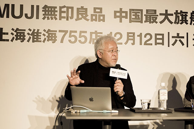
Kenya HaraVisualize the philosophy of MUJI
MUJI is more than simply a line of products. It is a way of thinking. “To be confident in a simplicity that feels in no way inferior to splendor.” “The simplicity that comes from stripping away frills can surpass splendor.” These concepts were advocated by graphic designer Ikko Tanaka, who was the first art director of MUJI. He then passed the torch to me. We don’t try to communicate this way of thinking by using a lot of explanation in words. Instead, we aim to communicate in a way that ensures people naturally understand these ideas when they encounter MUJI. Today, I would like to talk about several themes I have used to communicate these MUJI ideas.
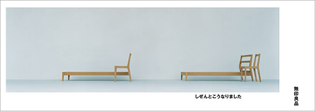
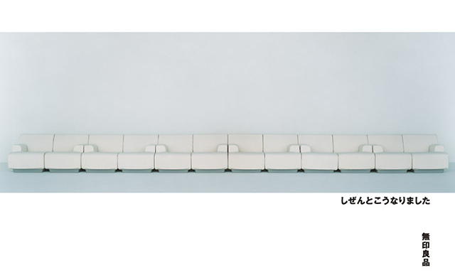
The first is the idea of “emptiness.” The idea of simplicity comes from Western contemporary design and takes a rationalistic form. But in traditional Japanese design, simplicity has a slightly different character. It is the simple form that gives users the freedom to develop their own way of handling an object. It is this depth that I call emptiness. MUJI essentially embodies this emptiness. For example, the MUJI mattress with legs can also be used as a sofa. You could also put several together to create an elevated floor. Giving users the freedom to use our products however they wish is what I mean by emptiness. We feel this is not something to be explained in words. Our visuals are designed to wake people to this emptiness so that users feel it the moment they seem them.
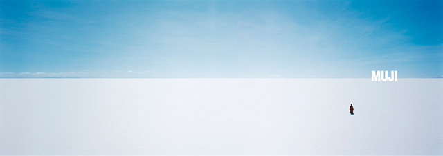
The corporate advertising campaign created in 2003 shows only images of the earth and human beings photographed on the horizon. Rather than convey a particular message, we focused on the presence of MUJI. This visual allows users to freely imagine what they feel MUJI to be. Creating these ads gave me a great deal of insight into how I myself think about MUJI. While brands around the world strive to create ads that make people want that product, MUJI sends out a message of emptiness. This is a stance that began with the horizon ad.
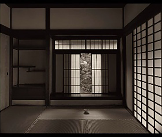
In this ad, we have a contemporary MUJI tea bowl placed in the Dojinsai room at Ginkaku-ji Temple. Built in the 16th century, this is said to be the first room in what is now known as the traditional Japanese style. This is an image that conveys that MUJI today embodies traditional Japanese culture, which values a simple, clean, empty, vacant aesthetic. The Japanese culture that admires clean lines and simplicity dates much further back than Western modernism, and it was in making this ad that I realized that MUJI’s roots come from this Japanese culture. We live in a global age, but it is very important to realize that there is a value deep in one’s own culture that speaks to the entire world. Being aware of this has, I believe, helped me develop a unique tone and manner for MUJI photos and expression. This isn’t simply a matter of taking a straight-on shot of a product. We let users and their particular lifestyle determine how they will use a product. With our products, you should be aware of this unique MUJI philosophy.

The second theme is “natural.” This advertising campaign is from 2008. The theme was hands. Hands at work… cooking, or spinning wool.
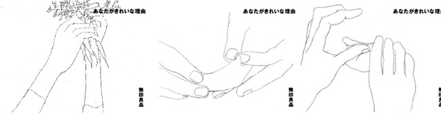
In my rough sketches for the ad, I focused on the incredible beauty of bare, unadorned hands at work. The copy, yasashiku shiyou, has many meanings. It can mean either being kind to someone or simplifying things. This copy is also ambiguous, and the copy can be interpreted in a number of ways.
The copy for this next corporate advertising campaign is “What happens naturally.” This is a bed and chair by product designer Naoto Fukasawa. Thinking about the meaning of a backrest, the back of a chair and a headboard would naturally take the same angle. In creating products, MUJI works toward a certain purpose and eliminates everything that is extraneous. This leads us inevitably to a natural design.
This Mold Sofa was designed for MUJI by designer Jasper Morrison. It has molded urethane cushioning inside. The ad shows a sofa unlike the conventional sofa, made using an extremely simple method. When we think of what MUJI is, our ads also need to be simple like this. That is part of our message.This was another Naoto Fukasawa idea, adopting the design of train station clocks just as they are.Masahiro Mori designed a Japanese and Western tableware series for MUJI.When you focus in like this on MUJI products, a certain tone naturally emerges. This is where we begin to create the mood for the ad or photo. MUJI stays away from trends when designing its clothing and styling its graphics and communications. The latest fads quickly become outdated. So it is vital to keep our designs just far enough away from trends that it’s not clear when they were created.
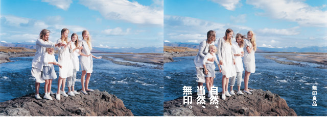
The 2014 ad image was taken on location in Iceland. This land was pushed up from the bottom of the ocean due to movement in the earth’s crust. It is extremely wild, but also very beautiful. I wanted to photograph women wearing MUJI clothes in a location like this. We searched for not one model, but for a family of three generations of women—a mother, daughters and granddaughters. While we were shooting, they began humming, and the scene was so perfect that we just started filming. We didn’t produce this ad at all. The women just reacted to what they felt from MUJI, and I was moved by what happened naturally. When I saw what was happening, I was moved.
The third theme is “home.” The year after we photographed the horizon ad, I felt that I wanted to take pictures of homes. The 2004 ads were shot in Morocco and Cameroon. At the time, I was thinking about the fact that MUJI is a brand that offers a philosophy about how to live, a certain kind of lifestyle. And my impulse was to capture this by photographing homes at the “end of the earth.” When Ikko Tanaka started to work as an art director for MUJI, the company had only about 40 items. By the time we started making these ads, we had about 5,000 items. With this many products, I thought that MUJI could represent a way of living. The idea of a MUJI “home” isn’t simply to fill your space with MUJI items. I felt that MUJI could help people who are good at breaking down ready-made ideas for what makes a home and rebuilding in their own way. When they’re brought together, I believe MUJI products serve as an “operating system,” or a concept or aesthetic, to make a certain lifestyle work. When you look at a MUJI store the size of the flagship stores in Yurakucho or Shanghai, I think we have the power not just to market individual products, but to offer a vision of an overall lifestyle. I believe that by helping more and more people gain the skills to redesign a house to fit their own lifestyle, rather than simply buy a ready-built structure, we are cultivating customers for MUJI, as well.
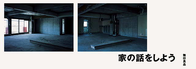
This is an ad from ten years ago or so. At that time in Japan, homeowners were not only buying newly built houses but also renovating older homes. The ad copy says “Let’s Talk Houses” and is accompanied by visuals of a house with everything— the floor, walls, ceiling — removed. This is when we began inviting customers to talk with MUJI about homes. Now MUJI literally offers houses among its products. We are starting a number of projects related to homes, such as our Infill 0 service, which means starting over from scratch in an existing house, and working with public corporations to renovate large public apartment buildings that are rented by the public. Before this, Japanese homeowners had always purchased ready-built, which is why everyone lived in the same type of house. But really you can live any in whatever type of house you want to. MUJI can help our customers to do this.
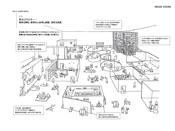
I have imagined how great it would be if we had MUJI stores where you could get absolutely everything you might need for your home—trees and plants, lights, solar systems, bathtubs, and beds. The House Vision project is one that I came up with while doing work for MUJI. With this project, MUJI and other leading Japanese firms collaborate with architects to present ways of living that we’ve never seen before. Using new technology and creativity, we visualized a great many new designs that could emerge from the trend in uniform houses we’ve seen in Japan.
It seems that for young people, as well as people in their 50s, 60s, and 70s, houses will be a very big market. There is also potential for reimagining traditional Japanese homes in a futuristic way. The House of Furniture design is a collaboration between architect Shigeru Ban and MUJI for House Vision. The support structure for the ceiling is made entirely from furniture. No walls or pillars… only furniture holds the ceiling up. This eliminates all dead space, which is the concept behind the design. MUJI works with modules sized to all fit together to form larger units. Combining the House of Furniture and MUJI module concepts, we created an extremely simple house with no dead space. This design is meant to be conceptual, to demonstrate one of the many possibilities you get with MUJI products and concepts.
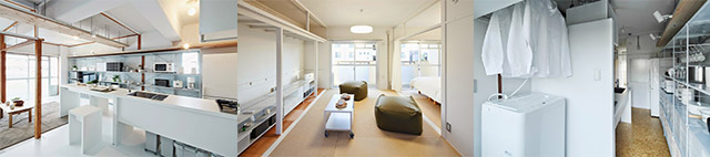
This slide shows public apartments built 30 or more years ago that MUJI helped renovate to illustrate how old apartments can be recycled. The idea is not to have everything in one’s home be from MUJI. Rather, it is about MUJI helping customers actively create lifestyles for themselves. Life is much more fun when you have the skills to envision the ideal home for your lifestyle. And if you possess these skills, you will be even more excited to see all the products in a MUJI store.
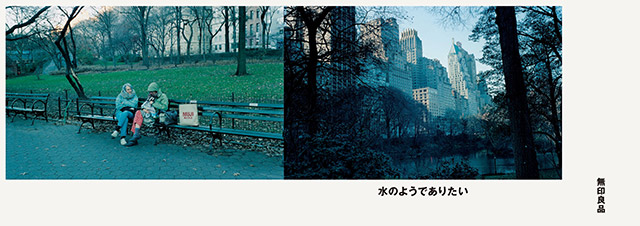
The fourth theme is “water.” There is a Chinese saying that water conforms to both the circle and the square. Water can take the shape of whatever space it is in. As MUJI has expanded with stores around the world, we took on the message one year that MUJI wants to be “Like Water.” We weren’t talking about customers diving into and immersing themselves in MUJI. Wanting to be like water is wanting to be part of the culture, to become an indispensable part of it.
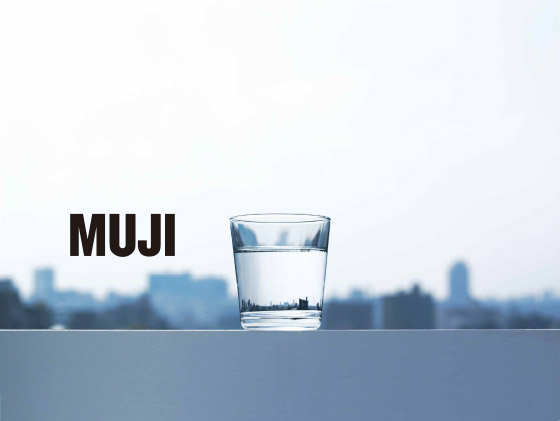
These are photos of cities reflected in a cup of water where the silhouette of the entire skyline is contained within the water. We took this glass to cities where MUJI has stores and photographed it all around the world. These large photos hanging in MUJI stores subtly convey the message that MUJI wants to be like water.
This corporate ad illustrates the fact that MUJI is all around the world. MUJI shopping bags are shown in different locations around the world to point out MUJI’s presence worldwide.
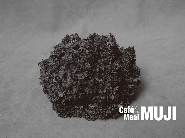
With this Café&Meal MUJI ad, we went into the fields for this black-and-white shot of parsley just picked from the field. Even without much copy, the large images hung in the store create a certain feeling that customers pick up on. The idea was to create an energetic and healthy atmosphere for diners by displaying vegetables fresh out of the ground.
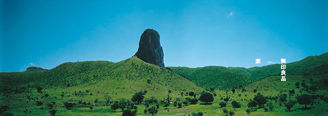
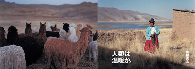
The final theme I will talk about today is “earth.” MUJI is always focused in on such details of life as houses and socks, but the shots for our corporate ads are as wide as possible to explore how we all live from a global perspective.About two years ago, I was searching the world for an ad theme, and found the Alpaca in Peru. These animals live on the Andes mountaintops in South America and are still as multi-colored as they were long ago. MUJI had begun to use Alpaca wool in its products. The women who live there knit sweaters, gloves and socks from the Alpaca wool they spin into yarn. The landscape here is extremely beautiful. I photographed this beauty in its natural state and used it in the ads.
I believe that images of people living naturally with the earth are extremely important.I took this photograph in Bolivia in 2003 for the horizon ad. I went to shoot the line where the sky and land meet. I wanted photographs that captured the sea, the land, and the sky in a single shot for our current ad campaign. The new cameras are incredibly advanced with fantastic resolution and focus that doesn’t blur even at wide angles. We put ours in a camera housing to protect it while shooting in the ocean. We submerged the lens halfway into the water for an image that is half underwater coral reef and half land rising above it.
This photo was taken in the Raja Ampat islands of Indonesia where the Indian and Pacific Oceans meet. It is said to be the most biodiverse part of the ocean in the world. The coral reef looks like forest growing under water and flows seamlessly into mountain forest above. We found coral blooming like flowers under water. It was an amazing sight. These flowers blooming where no one sees them. These are the colors you see underwater without any artificial lighting at all, and we submit to the viewer that this is “The Colors of Earth,” as the copy says. The ad’s message would be that this is how MUJI views the earth and that we use this as a model for what we do.

We also used the photo to make the sign for the Shanghai store. The Shanghai flagship store is the only place you can see the image this large, and I was very pleased to see that it had turned out so well.
We recently put out a book of messages similar to the ones in these ads. The book was edited by Kazuko Koike, and I did the art direction. The title, So Shu Ji Nen, is made up of four Japanese characters.
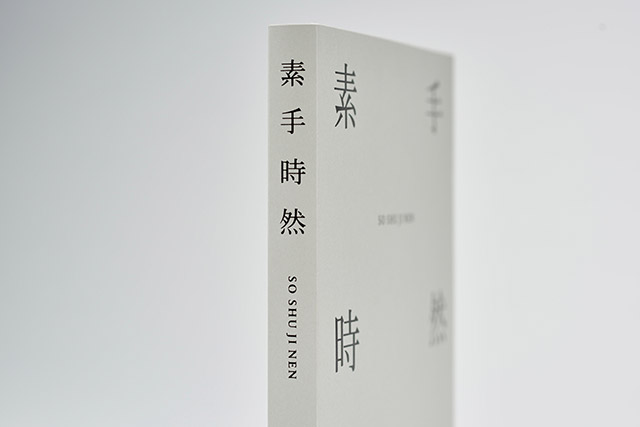
So refers to the original, natural state of a thing.
Shu means hand and refers to human activity, to making things by hand.
Ji is time. Here it refers to the history of the past and also to the future.
Nen comes from the Japanese word for “nature.”
The book is made up of four chapters by the same names: So, Shu, Ji and Nen. In this book, we brought together quotes from books from all over the world and various photographs to create new images. Kazuko Koike and I discussed things a lot to narrow down our selections for the quotes. There is no intended relationship between the meaning of the quotes and the photos. But the two together may lead the reader to interesting associations. It’s that kind of book. In some senses, this book is similar to what I’ve done with the ads. It is a significant way to communicate our ongoing thoughts about what the MUJI philosophy is.
<
>